This section is intended for both site designers and maintainers.
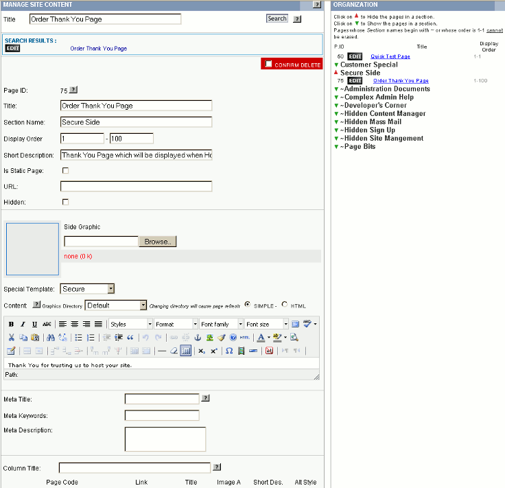
Overview: This is the section where the actual content is entered/modified. Additionally a small graphic for use in Side Column display can be entered and the template used to display the page is selected. Note: the actual content can be entered using either a word processing like editor (the default as displayed here) or in HTML (the language that the web browsers actually understand). The editor can be expanded or contracted by dragging on the lower right corner. For example in this picture its been shrunk so that the parts of the form below it will appear in the same image. It can also be set to full screen by clicking on the full screen button the the top row of buttons. Note: as you move your cursor accross the buttons a short explanation of what each button does will appear (balloon help) If you do not see the editor pictured and the Simple mode is selected, check your browser's configuration to ensure that Java Script is enabled.
- To associate a picture or other graphic with the page use the brows button to open the browser's File Dialog box and locate the picture on your computer.
- Unlike the Product Page Images or Images in the Media Manager, images are not re-sized by the system so this must be done using your own image editing software before you upload the image. It is up to the site designer to determine an optimal size for the Side Graphics but 125 pixels width is a good starting point.
- Once an image is uploaded it can be used on the page using the |.IMGA.| tag. It can also be found in the site's default directory.
- Unlike pages uploaded by the Media Manager function, Side Graphics will automatically be removed if a page is deleted.
- Images designed for printing (32 bit CYMK) will be silently converted to web format (24 bit RBG) images after upload.
- Simply select the correct page template using the Special Template drop down. The site designer should provide an explanation to the maintainer of where each of the templates should be used.
- Site designers can add templates by placing the files in the site's document root directory with an extension of 'tmp' or 'tpl'. The name of the will chosen will be displayed in the drop down with '_' replaced by a space.
- Site designers note, if a template is removed the site will used the default template.
- The media manager allows multiple graphics directories to be created. The editor graphics button, embedded media and link buttons will display a drop down list of the appropriate type files (e.g., images for graphics, documents and spread sheets for the link button) found in the selected directory.
- Warning: If you have a large catalog, select a directory other than the Default since the catalog images (both for Products and Categories) are saved in the default directory and it will take a time for the system to prepare the drop downs when you select the image, embedded media or link button.
- Changing the directory will cause the system to reload the page with the new directory selected. This is needed since the image directory is locked in the editor when the page is loaded. This page refresh will not change either the information on the page or the information in the server's database.
- The SIMPLE mode (default) uses an onscreen editor to access the image and link libraries. You can paste in text prepared in a word processor or make changes as you go. There is even a full screen mode so that you can see more of what you are editing at one time. I'll discuss some of its special features later. There is also an on screen help function to assist you.
- The HTML mode is useful if you have prepared a complex page using an HTML editor and don't want the simple system to destroy it by being too helpful. Generally it can be used when a form is needed and the simple mode is insufficient. HTML mode assumes you know exactly what you are doing.
- To switch modes you need to either Add or Update the page. There is no automatic refresh feature as there is with the change in graphics directory so changes will be saved. Normally the mode is set when the page is first built and left alone. To prevent a partially built page from being displayed when you change modes, temporarily mark the page as hidden.

- Special Tags: (these tags can appear anywhere within the content area)
- |.popup.| This tag causes the standard template to be suppressed and a very simple page to be generated. Normally this is used when the page generated will appear as a pop up off of another page. Again this tag must be placed at the beginning of the content area. The sites style sheet is still available but all other tags are ignored. A 'Close' button is now automatically added to the top right of all pop up pages. Clicking on it will cause the window to be closed. Note: pop ups will fill a full size browser window is called via side column or the the size defined in the page link if called out of another content page (see link button below).
- |.fetch.| This tag is replaced by the contents of a file from the top/root of the website. The site designer will have to place a file with the name of ##.txt where ## is the computer assigned page ID number.
- Using the on-screen editor: It basically acts as a special purpose word processor.
- If a button is greyed out, then it is currently unavailable. For example before you can create a link to either a pop up or another page you need to highlight the text or image which you wish to use as a link.
- As you move your cursor over a button brief description of what it does will be displayed.
- When you are in the content the Path right below text entry area displays the HTML structure up to that point. For example, as I type this the path show "ul » li » ul »li" because I am in the second level of an indented list. To go to another part of the text just use your mouse and move the cursor. Clicking on part of the path will select everything under it. For example selecting the second "li" would select everything from This entire bulleted element beginning with Where you are and ending with this.
- Unlike Microsoft Word™, if this editor gets confused or stubborn you can "lift the hood" by pressing the HTML button and look at the actual HTML that is being generated. Hint: As a general rule it is best to enter the text and then go back and modify it to add color or bolding.
- Before you create a table, make sure there is at least a blank line below it.
- If you create a unordered list (such as this help list) make sure you complete it and again have a blank line after the list before you completed editing of the page. If you fail to do this the system may not be able to reset get back to left margin.
- If you run into these problems click on the HTML button and scroll down to the bottom. You may have to manually enter a few characters after the table or in the case of list a {li}..{/li} before the final {/ul} and then click the update button. You will now have something that you can find with your cursor.
- The
 buttons cause highlighted text to be bolded, set in italics, underlined, or marked with a strikeout respectively.
 - The
 buttons cause the selected text alignment to change from the default Left to center, right or full respectively. Note: when working within a table use the table properties instead.
 - The Style drop down is populated from the default template's style sheet. Site designers can cause a style to be entered in the drop down by putting it in style sheet. Style classes can be hidden by ensuring the lead '.' in the style name is not on the left margin. Only class type styles will be selected.
- The Format, Font family and Font size drop downs are used to set these properties of the selected text
- The
 buttons toggle the editor's full screen mode and spell checking respectively. Clicking on the small black triangle allows selecting Spanish spellchecker (vs. the default American English).
- Cutting/Copying and Pasting Text. The
 buttons can be used to Cut, Copy and control how text is pasted into a page.
- The scissors button (cut) or Cntrl-X key combination, removes any highlighted text and puts it into your computer's paste buffer.
- The two sheets button (copy) or Cntrl-C key combination. copies any highlighted text and puts it into your computer's paste buffer.
- The last button controls how the browser's paste function works. When its not active (as in this image) pasting text from your computer's paste buffer will result in a direct copy of the raw information into the browser. Word Processors, particularly Microsoft Word drop a lot more than text into your page. Normally this is not desirable since it can destroy the existing formatting on the page. If the button is active (dark background) all the formatting is stripped off before the text is pasted onto the page.
- Paste can use the Cntrl-V key combination, the browser's Edit-Paste function or the paste function from the mouse's pop up menu. The information will be pasted wherever the cursor currently is.
- The
 buttons open 'find' and 'find and replace' pop ups.
 - The
 buttons select unordered list, ordered list, go up a level, and go down a level respectively.
- To start a list use the Enter key to start a new line and select either the unordered (i.e., bulleted list) or ordered (i.e., numeric list).
- To end a list use the Enter key to start a new line and then click on the active list button. If you are not returned to the left margin use the HTML button to close off any open HTML list elements (see above).
- Within a list to indent to the next lower level use the last button in the example (the one with the right facing arrow).
- Within a list to go up to the next higher level use the button with the left facing arrow.
- The
 buttons set hyperlinks, remove hyperlinks, set page anchors and add/edit images.
- The first button sets/edits hyperlinks. A hyperlink is a link which when clicked on takes the browser to another page either in the current window, a new window or in a javascript pop up.
- To set a link first highlight the text or graphic to be used as the link and then click on the closed chain button (since there was no text highlighted when this image was taken its greyed out). For standard hyperlinks past the address of the target in the Link URL box in the pop up dialog box. In the next row is a drop down which lists any in page link targets (called anchors which we discuss shortly). The next drop down specifies whether you want a the link to replace the current page or open a new browser window/tab. The default is to open the link in the same window/tab.
- The system also allows you to support a second kind of link using a 'Popup'. Clicking on this kind of link will open the target in a small window above the current page. To use this click on the Pop up Tab, Check the 'Use Javascript Popup' box and the paste the address of the target in the Pop up URL box. The various check boxes below describe what features the box can support (e.g., address bar). You can also limit the size of the resulting pop-up using the 'Size' entries to specify the width and height of the box. Additional options are available in the Events and Advanced tabs.
- To edit an existing link, place the cursor over the linked text/object and click on the closed chain button. The same pop up dialog will appear.
- To remove an existing link, place the cursor over the linked text/object and click on the broken chain link (next the closed chain link).
- The third button in this set is used to set or edit in page anchors. These are used to jump around on a page. For example the list of sections within this help page are each preceded by an anchor so that the list at the top of the page can jump directly to that section without the visitor having to scroll down. Similarly near the top of the page is an anchor 'top' which is tied to each of the Go to top links on this page.
- To add, just move the cursor near the place you want the browser to move to when the link will be pressed. Enter a descriptive name in the pop up and Click Add.
- To change, highlight the anchor tag and click on the Anchor button and make the name change. Note: if you have already linked to that anchor, that link will no longer work.
- To remove an anchor, again highlight the anchor tag and then use the Delete key to remove it.
 The last button in the set (it looks like a tree) is used to add/edit images. It opens a pop up like this
- If you have selected the correct media directory the Image List drop down will have a list of the images in that directory. If the image is elsewhere put its address in the Image URL box.
- After you selected an image, write an Image description in the that box and erase the Title.
- On the appearance Tab you can select how the text will wrap around the image. If the image is going to be a link, make sure to set the border to '0' unless you want a border to appear. For linked images, browsers add a border by default. For non-linked images no border is the default.
- The advanced tab allows you to setup a secondary image which will replace the first under certain conditions (e.g., when the mouse cursor hovers over it).
- To edit an existing image, select the image and click on the Image button and make your changes.
- The first button sets/edits hyperlinks. A hyperlink is a link which when clicked on takes the browser to another page either in the current window, a new window or in a javascript pop up.
- The
 buttons set the color of the text and set the background of the text respectively. To use, highlight the effected text and click on the button. Note: if within a table use the table row or table data buttons to set the background color for the entire row or data element, just just behind the text. This is critical as some text may not completely fill the element if other elements are larger or if there is padding.
- The
 buttons control the creation and appearance of tables. In the web a table consists of a fixed number of rows of a fixed number of columns of table data elements. Each row is built left to right followed by the next row. Each table will begin a new line (i.e., unlike graphics you cannot have text wrap around a table).
- The first button is used to create/edit tables.
- Clicking on it will open the table dialog box. By default a table will be setup with two columns and two rows, change that if you need more/less rows or columns. if you guess wrong you can change it later.
- Cell Padding is the space, in pixels, around the contents of table data elements. Cell spacing is the space between the table data elements.
- Alignment controls the horizontal alignment of the table structure, not the data within the table.
- Border specifies the width of a visible border around each table data element. Some browsers will put an invisible border around the elements if '0' is not entered here and Cell Padding and Cell Spacing fields.
- You can specify a fixed width and height for the table in either pixels or percent (e.g., 80%). If nothing is specified , the table will grow as needed.
- The classes drop down will specify any available style classes. Warning: there is no guarantee that the classes are appropriate for the table, consult your site specific documentation.
- The Advance tab exposes controls to fine tune the display of the table appearance. Most commonly used would be the Border and Background colors which set colors for those two features. Note: the border color features assumes a non-zero visible border around each data element. The results will be put in the Style line.
- The next button controls the table row properties. It includes the option to change all rows, the current row or all odd or even rows. If the latter two are chosen new rows added later may not be affected.
- The third button changes the properly of the current table data element.
- The next three buttons allow you effect the number of rows in the table. The first adds a row before the current row. The next adds the row after the current row. The third removes the current row and all of the content in that row.
- The next three buttons similarly change the number of columns.
- The last two buttons split and merge selected cells. For example a title row of a table might need to span all the columns of a table. Click on the upper left cell and then specify the number of columns and/or rows to merge.
- The first button is used to create/edit tables.
